Hiding a button to provide feedback
Do you ever use FileMaker’s layout object’s “Hide object when” behavior to hide a button until some criteria have been met? It’s a nice way to provide feedback to the user and makes for a good user experience. But what you might not know is that you can use hidden state as a way of validating whether a script can run. Here’s how.
Let’s say you have an input dialog or a form that must be filled out completely and with valid values before the user can save the info in it. We like to display a “dead” button until all the criteria are met, after which the “dead” button will be replaced by a “live” button. You can do this by stacking the “live” button on top of the “dead” one and then use the “Hide object when” in FileMaker’s Inspector in the Data tab.
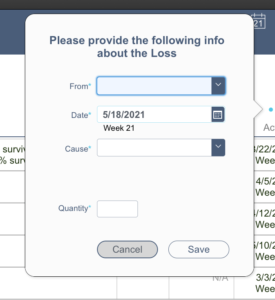
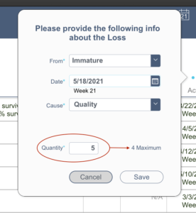
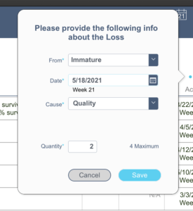
The examples below show an input form in a popover for recording a loss from a nursery management software we developed. The “Save” button only appears to be live when all requirements are met.
In the first 2 examples above the Save button provides feedback to the user telling them that they can’t proceed. In the 3rd example, the user can see that all criteria have been met because the live Save button is displayed.
The calculation for hiding this particular button is shown below. The last thing you’ll want is to have to maintain it in two different places. Keep this thought in mind because I’m leading up to the part where we get around this undesirable duplicity by leveraging the GetLayoutObjectAttribute ( ) function.
All was going great until users got their hands on it
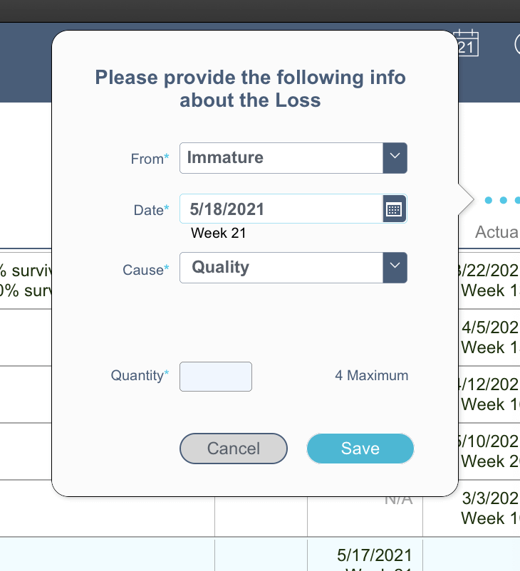
So far so good. We’re providing really nice user feedback, right? What could possibly go wrong?, you might ask. Users. They’ll always figure out a way to break things (they really don’t mean to, it just happens), and here’s how they can end up with a live Save button when the script shouldn’t run.
Self Preservation Is Also A Mother of Invention
Now I faced a dilemma. I had a very nice UX design for buttons, but it had a major flaw that I was addressing with duplicate code. I considered putting the calculation in an offscreen text object and then using the Evaluate () function. But this approach was fragile due to the need to reference a hard-coded object name in multiple places.
The next option I considered was to duplicate the logic at the beginning of the script that the Save button triggered. If the calculation for hiding the button resolved to be true, all I had to do was exit the script. I felt it was a step in the right direction, but I still wasn’t happy with it because I was still duplicating the calculation.
Better (but still not great)
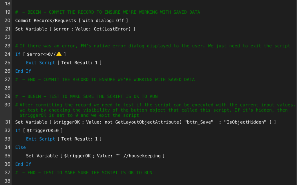
Even though I wasn’t pleased with the last option, I felt it was the least worse, so I started to implement it when the proverbial lightbulb came on in my head. Why don’t I just commit the record, which would result in the live Save button being refreshed to its proper hidden state? Then I could use GetLayoutObjectAttribute ( “myButton” ; “isObjectHidden” ) to determine if the script can continue or it needs to be canceled.
The following shows a segment of the script that tests whether the button object is hidden or not. If it’s hidden after the Commit step, then the script exits and the user sees the form with the dead Save button.
Problem Solved
User experience design is an important consideration in all apps we develop. So is keeping things as simple as possible from a development standpoint. I hope you found this to be an interesting case study of how challenges can arise when trying to provide a good user experience, and how a little “outside the box” thinking can lead to ways of overcoming challenges while maintaining simplicity.
If challenges in your FileMaker solution are stumping you, drop us a line. There’s a good chance that we’ll be able to either teach you the skills to overcome those challenges yourself or do the work for you.


